1- DON�T CHOOSE COLOR FIRST
Avoid choosing a color first as part of your interior project, try to choose laminates, colors, veneers first for your furniture and then match the wall colors accordingly, this is quite easy and less risky.
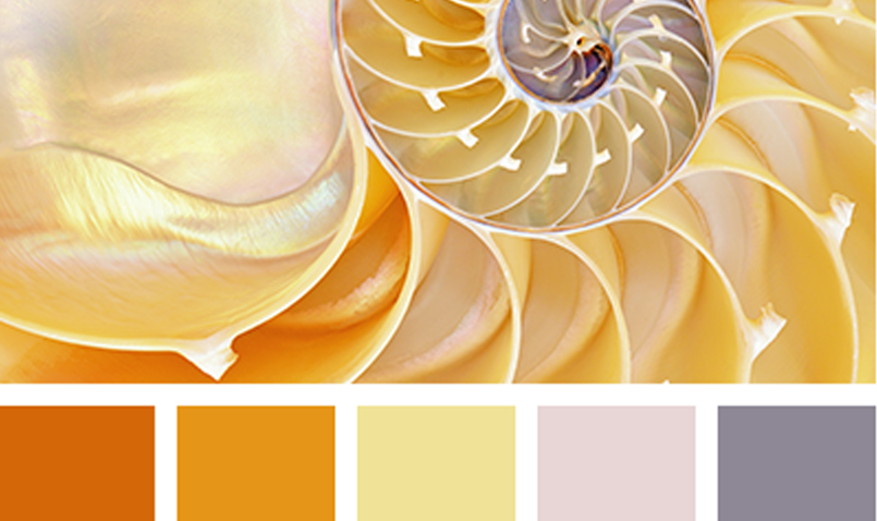
2-INSPIRATION WILL SURELY HELP
Thousands of inspiration images are available on various portals like Houzz, Pinterest, etc, make a repository of such images at least 10 images for every room check out if your furniture color matches with those inspiration images at least couple of big pieces of furniture colors shall match with inspiration images. Try to search a couple of color pallets which are available easily on the internet, make sure these color pallets have a color member which is the color of existing furniture, these color pallets have 4-5 colors which form good theme, there is a lesser risk if we use the colors as per the color pallets.
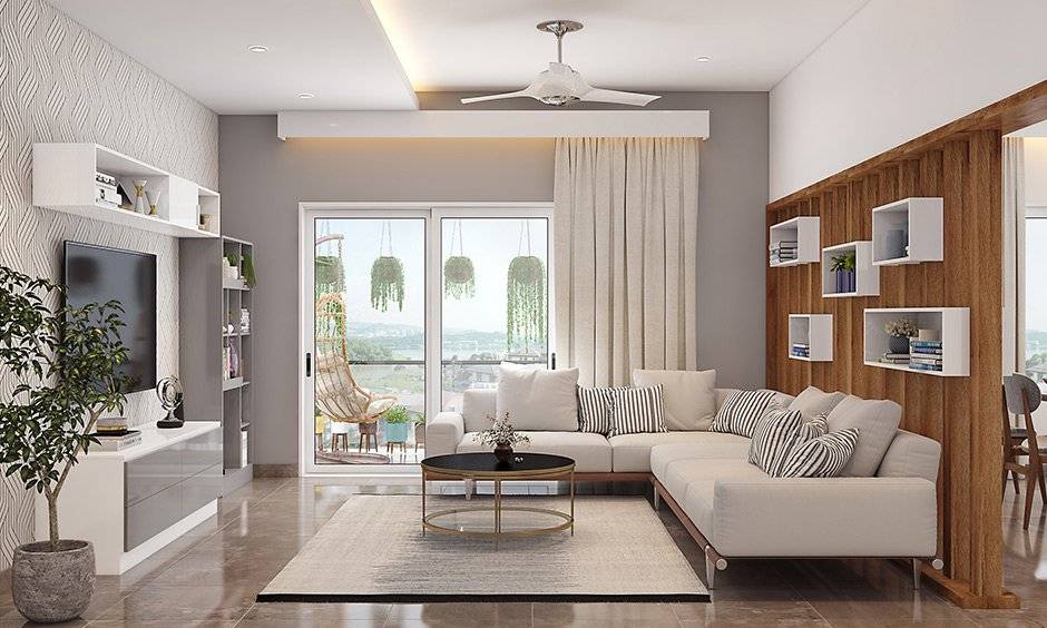
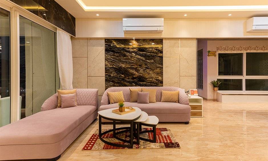
3- NEUTRALS OR BOLD COLORS
Shall we avoid bold colors all together? That�s not the best solution, many people just go for neutrals wall colors to avoid the risk across the complete house, that may not be the right approach, let�s have some bold colors at a couple of places in the home. To use bold colors one has to first decide where do you wish the attention in a room to go first? If your answer is the walls, then let�s go bold, but make sure when you go bold most of the other things in the room should be quite neutral so that you don�t end up with too many bold color things competing with each other.
Every color is related to some emotions in human nature like�
- Black � Unhappiness or emptiness
- White � Purity, Innocence
- Red � Love, excitement
- Blue � Calmness, sadness
- Yellow � Warmth, Energy
- Brown � Firmness, reliability
- Purple- Wealth, mystery, wisdom
- Orange- Enthusiasm, attention
- Pink � Romance
4- USAGE OF TESTERS.
Before buying liters of colours, we advise to buy testers for the similar shades as there will always be confusion among a couple of nearby matching shades, once you apply the shades observe this shades for a couple of days during different times of the day, you will get to know the impact of the shade at different time with respect to different light available at that moment in room.
Nowadays most of the brands have the testers available in various size like 100 ml to 250 ml.
One important tip to add depth to space, use the ceiling shade half the strength of the wall that will give good depth to space. Strictly don�t paint the ceiling any color if you already have a lot of faint or white color in the room. It is always recommended for fabulous results to relate the ceilings and wall colors rather than painting ceiling just the plain white. It is recommended not to paint an entire large living space all one color, it is advised to break it up into sections.
5- TRY YOUR PAINT COLORS AGAINST SOFAS AND CURTAINS
You can paint a large piece of cardboard and hold it against your sofa, dining, curtains, etc and try to judge overall combined look of the set up, you can take a couple of snaps from various angles and evaluate if it goes well with the surrounding, this activity will really help you select your right shade.
6- PICK THE RIGHT GLOSS.
Any gloss or shine will accent flaws on the painted wall, so if you wish to cover the flaws or unevenness on the wall surface then choose as little sheen/gloss as possible, the higher the shine, the more durable color will be, this you can consider as thumb rule while choosing your paints.
Guideline For Choosing Paints:
- PLASTIC PAINT: very less shine, recommended for ceilings and low traffic areas in the house, not very washable.
- Oil-based luster paints: Shiny, washable and durable and can be used in high traffic areas in the house, it can be easily wiped out.
There are various types of paints are available with different companies, will recommend checking their websites to know the shines, washability and durability of those paints before buying.
-
 July 20, 2026
Teak Wood Furniture in Pune
-
 July 17, 2026
Commercial Interior Designers in Pune
-
 July 13, 2026
Interior Designer in Hinjewadi
-
 July 10, 2026
2 BHK Interior Design Cost in Pune
-
 July 7, 2026
Best Interior Designing Firm in Pune
-
 July 3, 2026
Stylish Interiors That Fit Your Budget
-
-
 June 27, 2026
Highest Rated Interior Decorator in Pune
-
 June 24, 2026
Transform Your Dream Home Within Budget
-
Post a Comment